Work

WorkSmartsheet2016–18

Mobile was the gateway drug. Smartsheet part one.

TL;DR ↓

Smartsheet, 2016. I joined to fix a mobile app rated 1.8 stars. Everyone said it was fine. People were in it all day. I didn’t believe it.

Year2016–2018

ForSmartsheet

RolePrincipal to Director

TypeResearch, mobile, brand

StatusShipped. IPO in 2018.

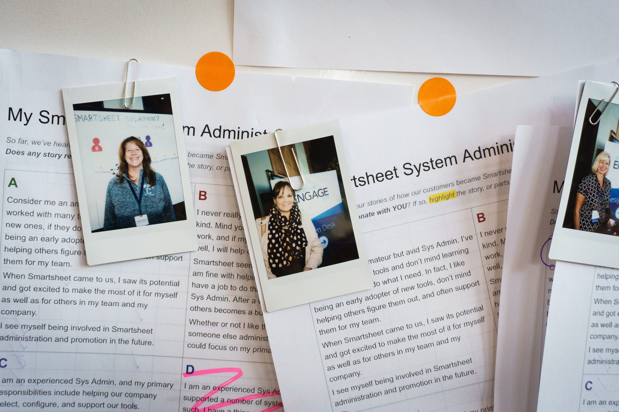
Instant photos of customers clipped to printed system admin persona stories, with highlights and orange dots
Customer stories and the power of feedback.

The way in.

01Lie

The mobile app was the desktop sheet, shrunk to fit a phone. The plan was pinch and zoom. It sat at 1.8 stars.

The number everyone pointed to was time on task. Sessions averaged 8 to 15 minutes, and long sessions read as a win. By that number, mobile was healthy. People lived in it.

I lived in it too. Within days I could see the disconnect. Small type. Bad tap targets. A clunky login.

I thought they were stuck in it.
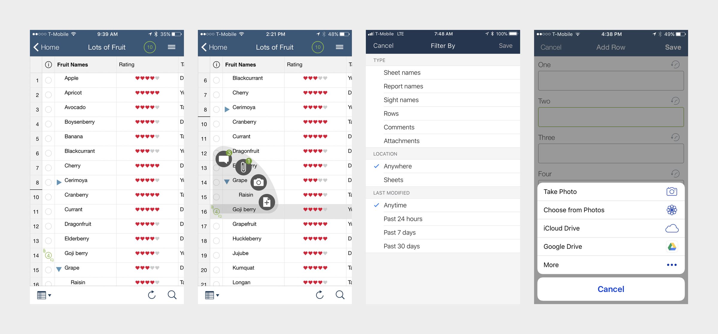
Four phone screens from the original app: the full spreadsheet grid on a phone, row actions, a filter panel and an add-row form
1.0   Before. The desktop, shrunk.

02Ask

I pitched a teardown and a mobile-first rebuild. Then I asked for something rare at a frugal, pre-IPO company. Budget and people to go see users before we built anything.

A PM, a researcher, a marketing lead and me. An ethnographic field trip to three of our heaviest mobile customers. Days on site, not a survey.

A Yellowstone Club golf fairway and pond below Lone Peak, framed by a split-rail fence
1.1   Yellowstone Club, Montana.

03Field

Two of them taught us the most. Montana and Las Vegas.

At the Yellowstone Club, housekeeping and facilities kept the app open all shift. Not because they loved it. The signal was bad and every sync took minutes. They were waiting, not working.

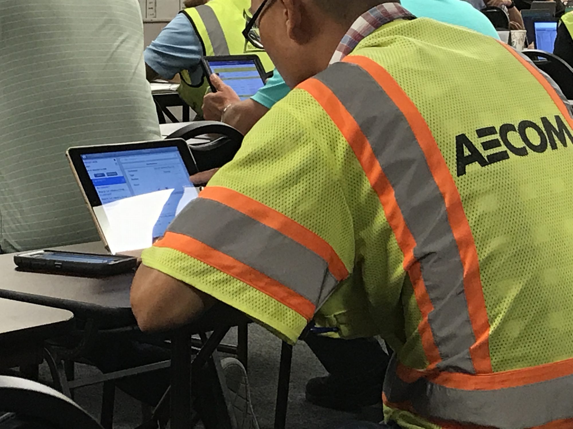
At Kiewit, on a multibillion-dollar Las Vegas expansion, crews in work gloves couldn’t hit the touch targets. Heavy usage was failed taps.

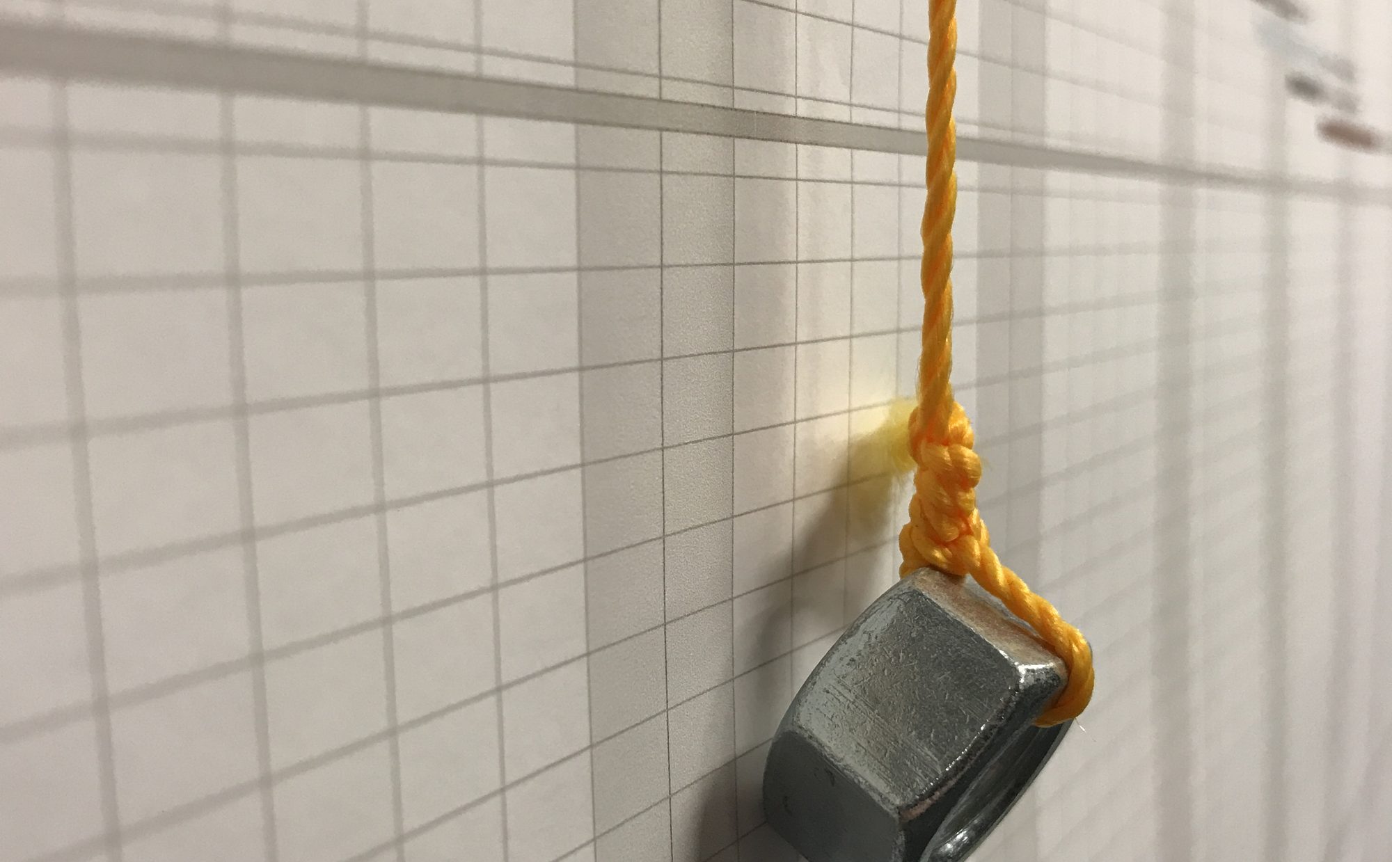
And the schedule wasn’t in the app at all. It was printed, taped across several walls, and tracked with a nut on a string.

The metric had been lying for a year.
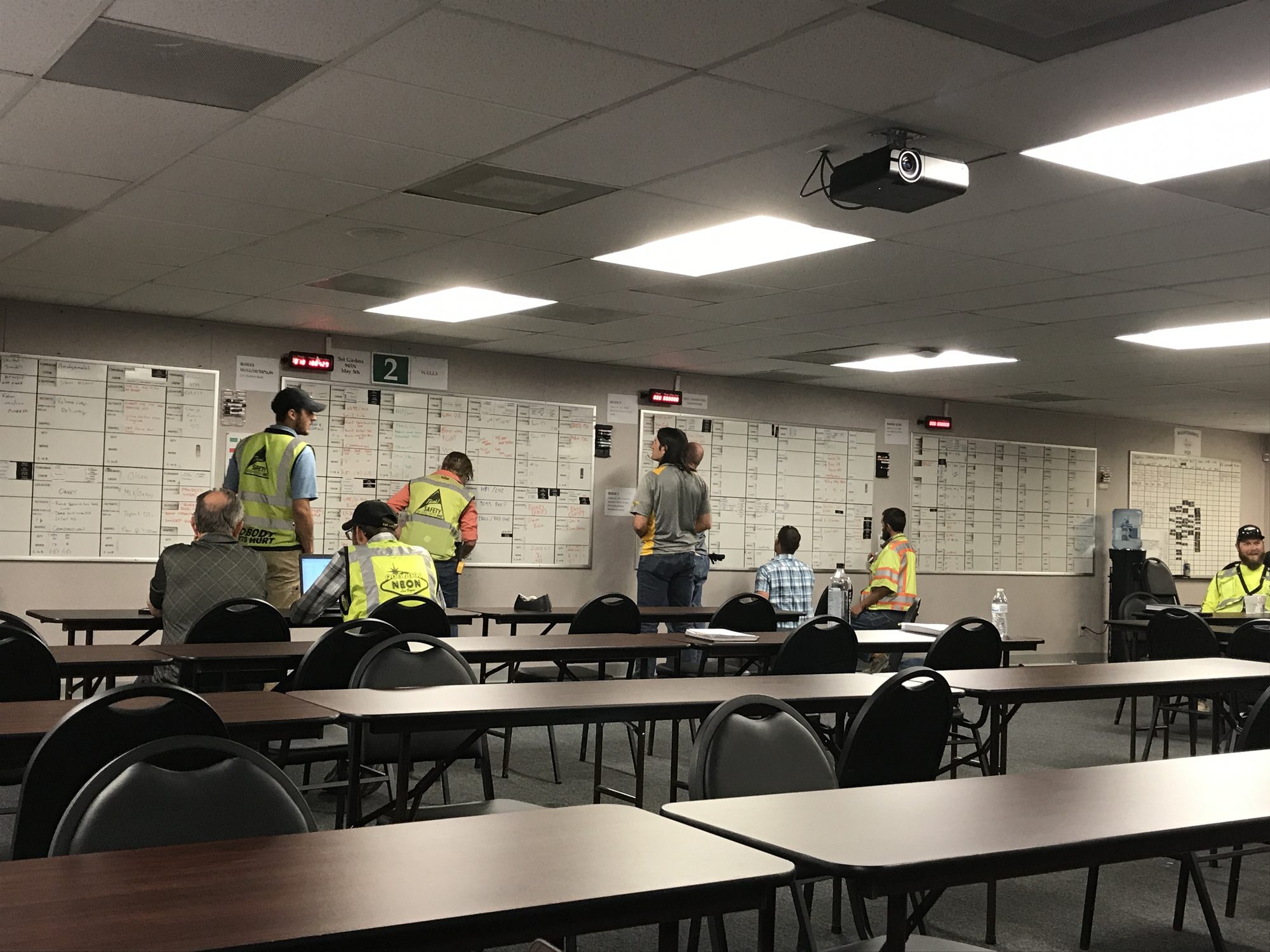
Crew members in safety vests reviewing printed schedules that cover the walls of a site office
1.2   The real plan. On the wall.
A worker in a high-visibility vest using a laptop at a folding table
1.3   Field crews, Las Vegas.
A steel nut on orange string hanging against a printed project schedule taped to a wall
1.4   The schedule. Tracked with a nut.

Billions of dollars. Tracked with a nut on a string.

04Reframe

The fastest users were the ones nobody studied. They spent the least time in the app because they’d found workarounds that worked.

I’d already made a call. The trip proved it. Mobile and desktop shouldn’t do the same job.

Mobile captures. Desktop decides.

So mobile stopped being the whole app, smaller. It became an input device.

  • Forms, not grids.
  • Offline sync, for when the signal drops.
  • Push notifications, so the wall comes to you.
  • Native iOS and Android. Not one skin for both.

Desktop became the place things land: review, build, run. Both got new experiences built for their job, and notifications tied them together. Capture something in the field and it lands on a desk. Change something on a desk and the field knows.

Each side made the other better.

05Ship

New home and navigation, June 2017. Five tabs: Home, Recents, Favorites, Search, Notifications.

Then offline sync, the fix the field trip demanded. On a property, inside or out, Wi‑Fi came and went. Crews waited for a signal before syncing, and wrote on paper in the meantime. Work stalled. Reports ran late. Now they logged it on the spot, and the app caught up the moment it found a connection.

Time on task dropped. The metric everyone loved got worse the moment the product got better. The power users we found next? In and out in one to three minutes.

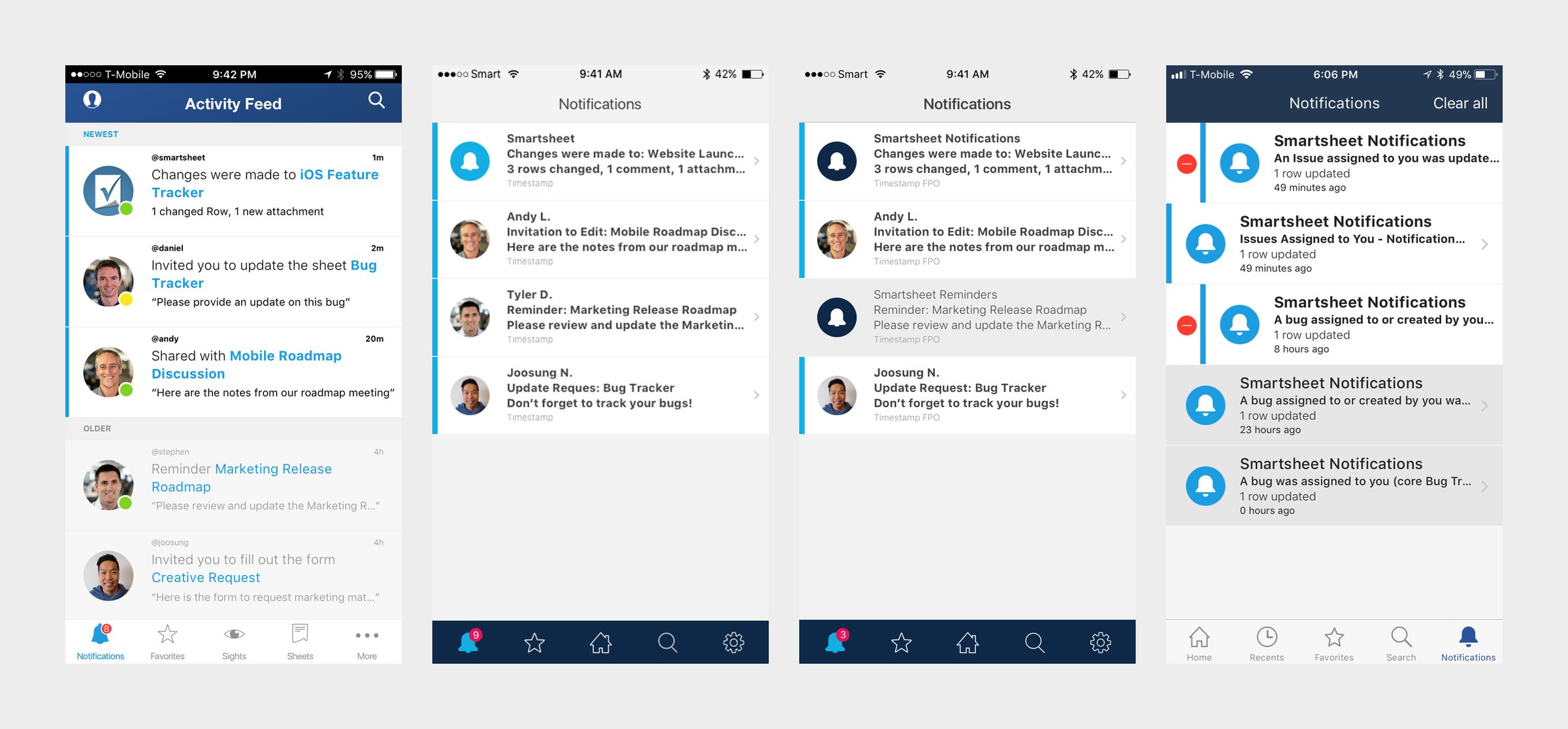
Notifications synced with desktop. One place for every update, with a badge when something changed. Filters matched desktop, so nobody had to learn the product twice.

We shipped on a ten-day cycle and answered feedback in public. Including from people who missed features they never used. Eventually, mobile web was retired.
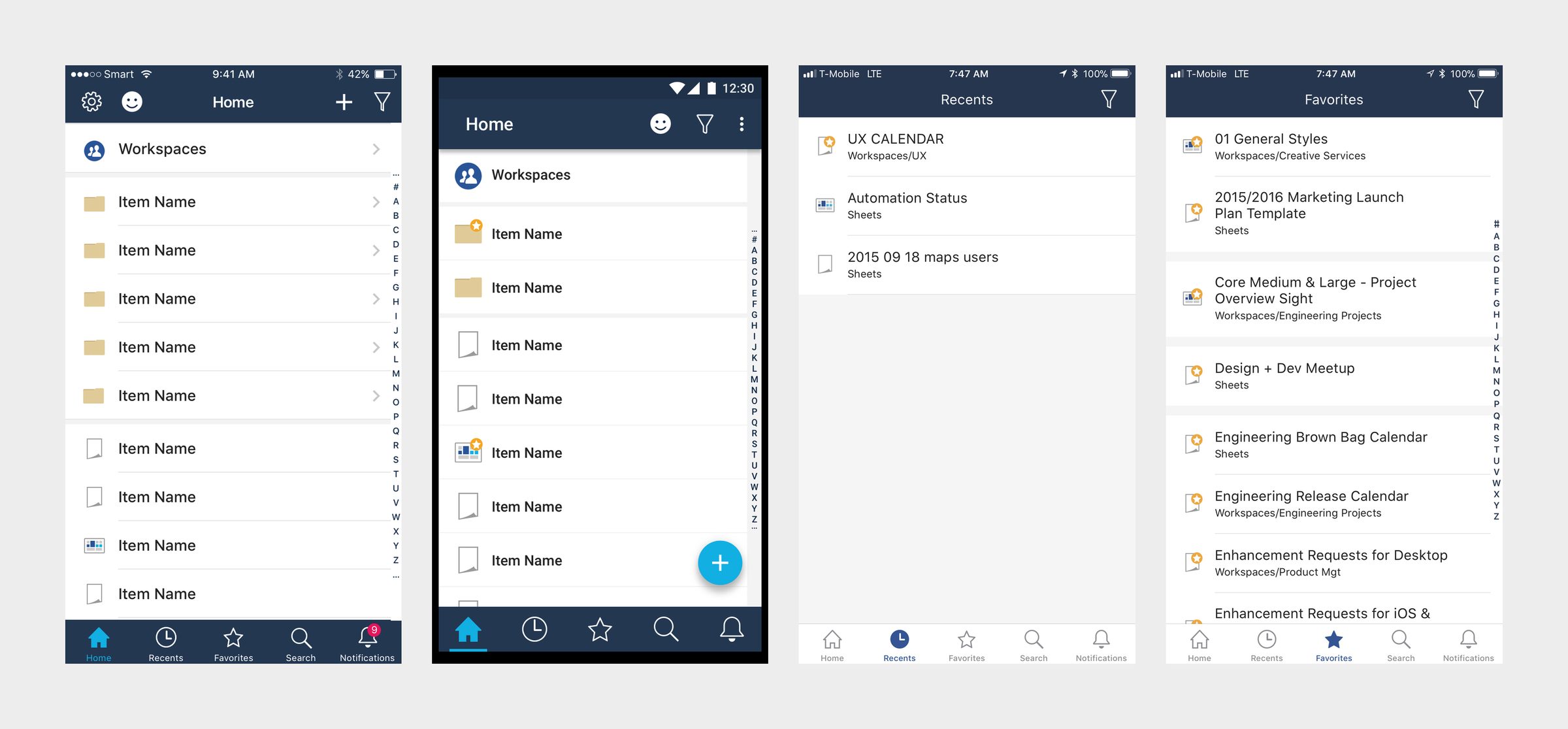
Four phone screens: the new iOS and Android home with workspaces, plus the Recents and Favorites tabs
2.0   New home. iOS and Android.
Four phone screens: an activity feed concept, two notification design studies, and the shipped notification center
2.1   Notifications. Concept to shipped.
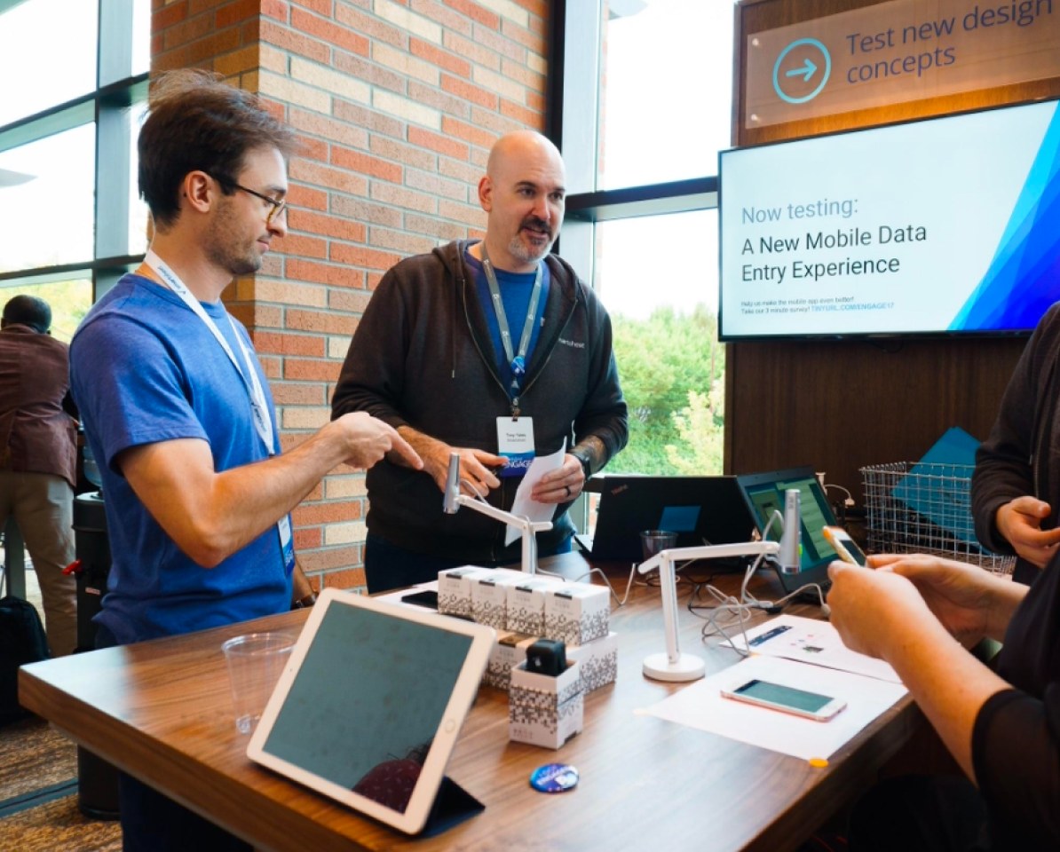
Tony at the Engage 2017 test-new-design-concepts booth, talking with a customer next to a screen reading Now testing: A New Mobile Data Entry Experience
2.2   Engage 2017. Testing the new mobile input, live.

06Number

1.8 stars to 3.8 by July 2017. Then 4.8.

Both of those accounts expanded. The visual language moved from mobile into desktop, then into the brand.

That last part is where the job changed.
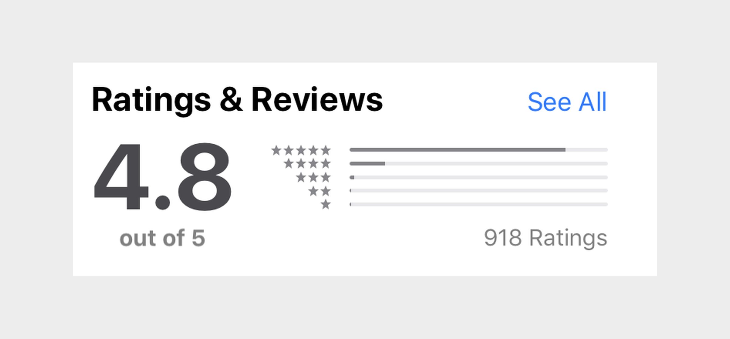
App Store ratings and reviews: 4.8 out of 5 from 918 ratings
2.3   4.8 stars. 918 ratings.
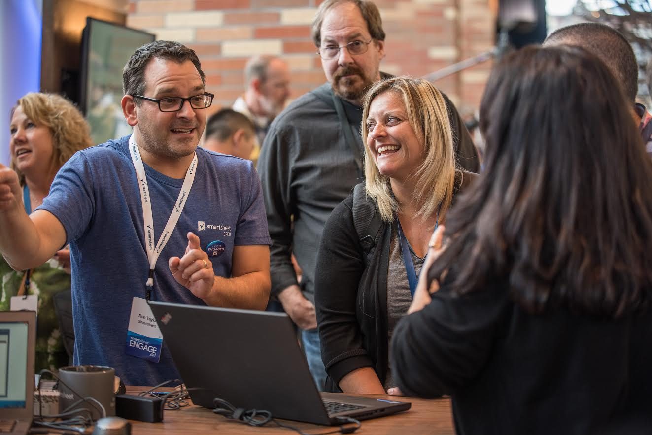
A Smartsheet staffer in a blue Smartsheet shirt demoing on a laptop to smiling attendees at the Engage conference
Engage. My buddy Ron, mid-demo.

The bridge.

07Gap

Product and marketing weren’t talking. The brand book said one thing. The website said another. The app, email and events each said something else. Even the logo had versions.

Creative couldn’t do product work. Product couldn’t do creative. I could do both, so I kept getting pulled into the middle.

My deck to leadership opened with one word. Disconnected.

08Bridge

It started with notifications.

Mobile needed empty states and a first run. That’s brand work with a product badge on it. So I proposed one element to tie every surface together. App, web, email, events, print.

Then the logo. I was leading mobile, and it didn’t hold up on a phone. At small sizes the check got lost and the type blurred together. So I adjusted it, ever so slightly. It’s still their logo today.

The brand changed. The website changed. I was in the room for all of it.

09Role

My UX director and I ran the design team as copilots. She saw where this was going before I did. She pitched a new role for me: Director of Design Strategy. The person who lives in both worlds.

A new VP of Product had to believe one person could run both. I made the case. Principal to director. Product, brand and creative, one design org of 24.

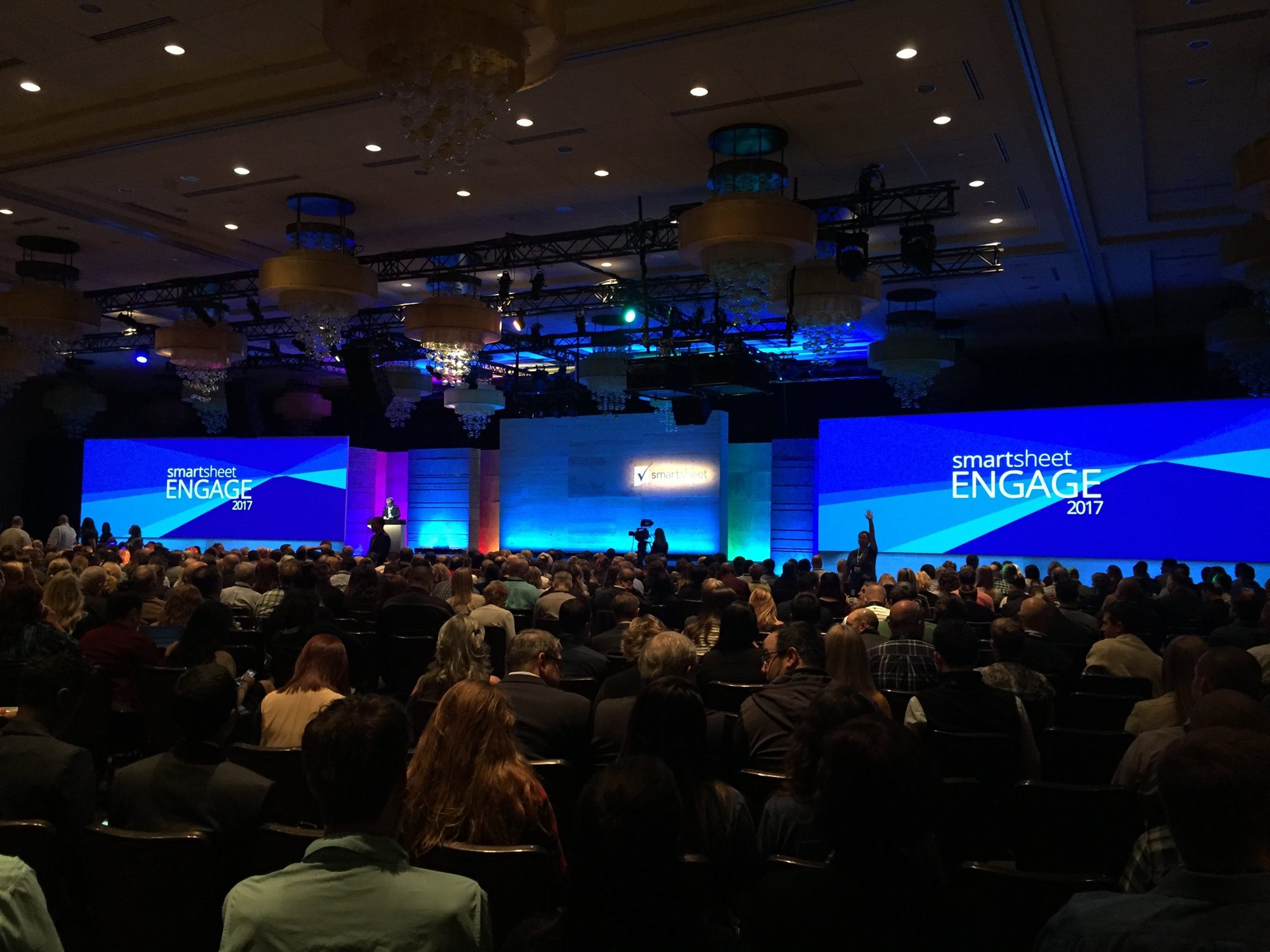
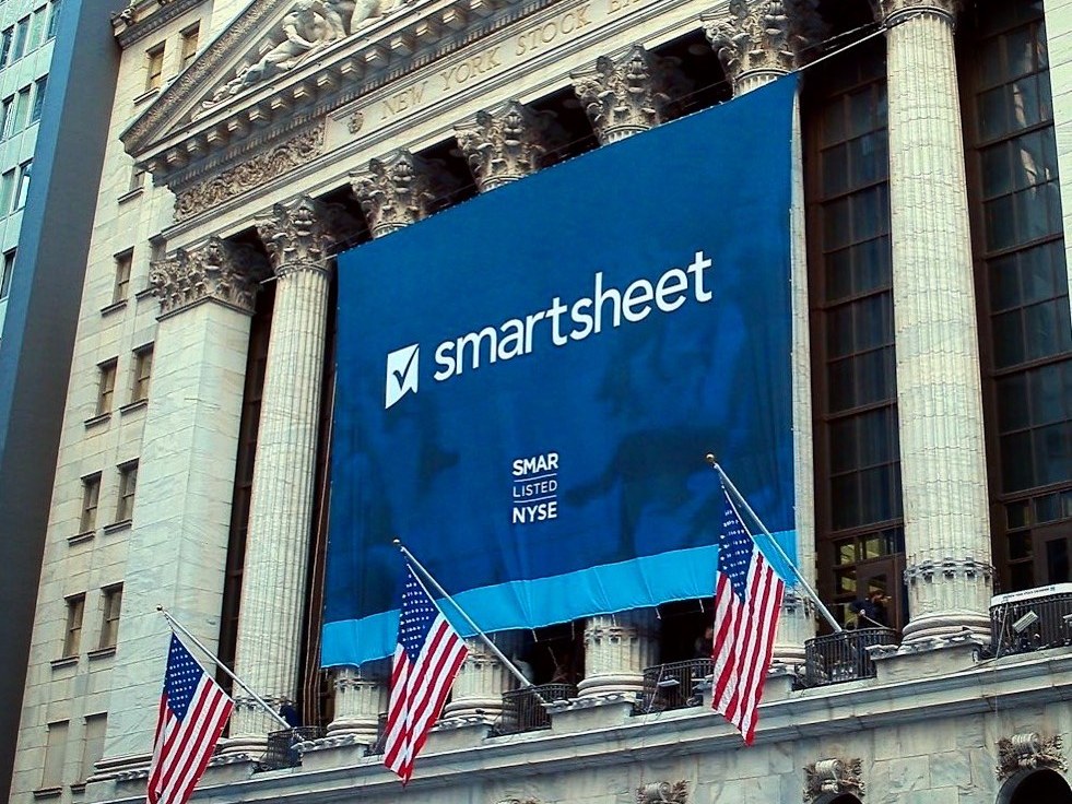
Then the big rooms. Engage, with writers, creative directors, photographers and videographers. Then the IPO. I helped draft the materials and designed the listing graphics for the NYSE debut as SMAR, banner on the exchange floor included.

A packed ballroom facing the Engage 2017 keynote stage, with Smartsheet Engage on two giant blue screens
3.0   Engage 2017. The big room.
A Smartsheet banner reading SMAR Listed NYSE hanging across the columns of the New York Stock Exchange
3.1   NYSE. Listed as SMAR.

10What it changed

Mobile got me in the door. Notifications got me into brand. Brand got me the room.

Smartsheet went public in April 2018.

Fix what people touch. Then fix what they see.

TL;DR

Problem

A 1.8-star mobile app everyone thought was fine, because the wrong metric said so.

Movement

Go see the users. Split the jobs: mobile captures, desktop decides. Then bridge product and brand.

Outcome

4.8 stars. Principal to director. A design org of 24 through the IPO.

Moment

A nut on a string, tracking a multibillion-dollar job across a wall of printouts.

1.8Stars when I started
4.8Stars after the rebuild
10Days per release
24Designers, product to brand